
Curated Spaces: Flooring Palettes Shape Purposeful Environments
Flooring Palettes for Room Design
A Designer-Led Exploration of Color, Pattern, and Performance
Curated Spaces is more than a set of flooring palettes. It represents a design mindset centered on emotion, function, and the identity of the spaces we create. Each palette reflects a clear vision, whether the goal is playful energy, modern creativity, refined sophistication, or elevated luxury. Every mood has a matching style that helps bring the environment to life.
A Conversation with the Designer – Creating Environments That Inspire
This collection of palettes was developed by an interior design team focused on how spaces shape the way people feel and interact. Led by designer Patrick Parker, the group drew inspiration from higher education, residential communities, and contemporary workplaces. Their approach blends strong color stories with thoughtful installation methods and material choices. The result is flooring concepts that feel intentional, engaging, and welcoming.
Higher Education Highlight: Muted Palette Featuring Soft Geometric Textures
The Muted Palette showcases gentle color transitions and an asymmetrical layout that adds movement to student focused spaces. Designed to bring students and faculty together in purposeful work zones, this palette supports collaboration while maintaining a sense of calm. The design team explains the intent behind these choices:
- Finishes were selected to balance playfulness with sophistication, helping create a supportive environment for learning.
- Color was used to reinforce school spirit and encourage a sense of place.
- Textural solids create a refined base layer that brings clarity and focus to faculty work areas.
Higher Education Highlight: Playful Palette Featuring Bold Contrast
The Playful Palette combines natural color inspiration with expressive geometry. Using a mix of blues, greens, and warm tones, this concept creates an energizing learning atmosphere. According to the design team:
- The color story draws from nature, balancing calm hues with bold accents.
- Angular patterns and rhythmic stripes introduce contrast that sparks creativity and curiosity.
These elements work together to create an environment that feels both grounded and dynamic.
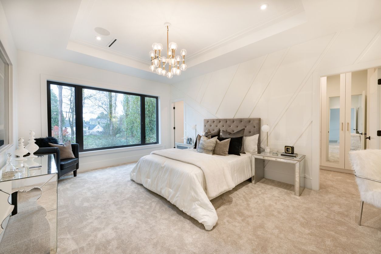
Multifamily Highlight: Neutral Palette for Tranquility and Visual Interest
For multifamily spaces, the emphasis is on comfort, community, and long lasting appeal. This palette uses neutral colors and soft organic patterns to create a calm and inviting living experience. The design team notes:
- The palette is centered on quiet luxury, using subtle tones to support a peaceful atmosphere for residents of all ages.
- Asymmetrical layouts add visual interest in long corridors and help highlight unit entrances with understated elegance.
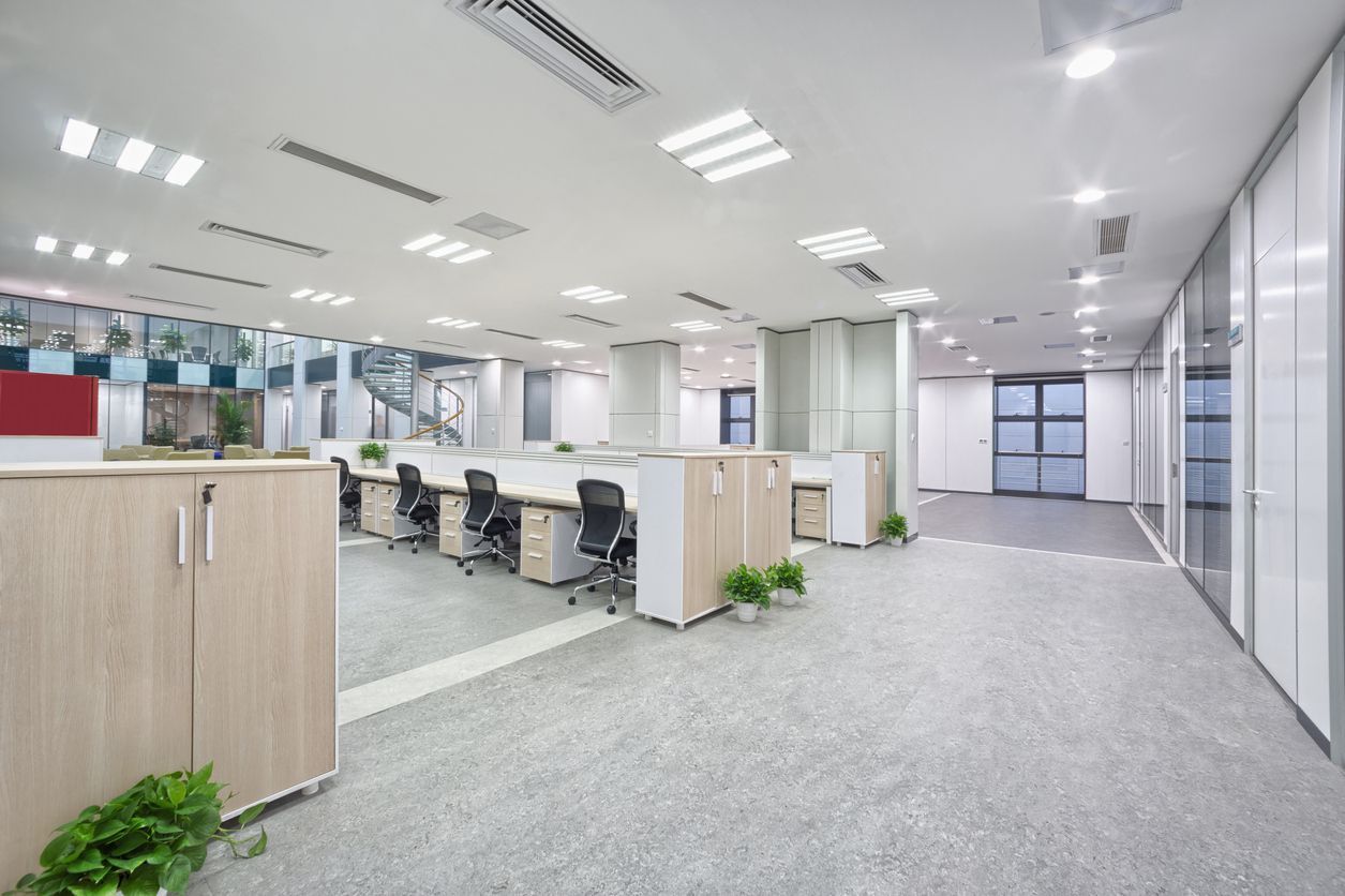
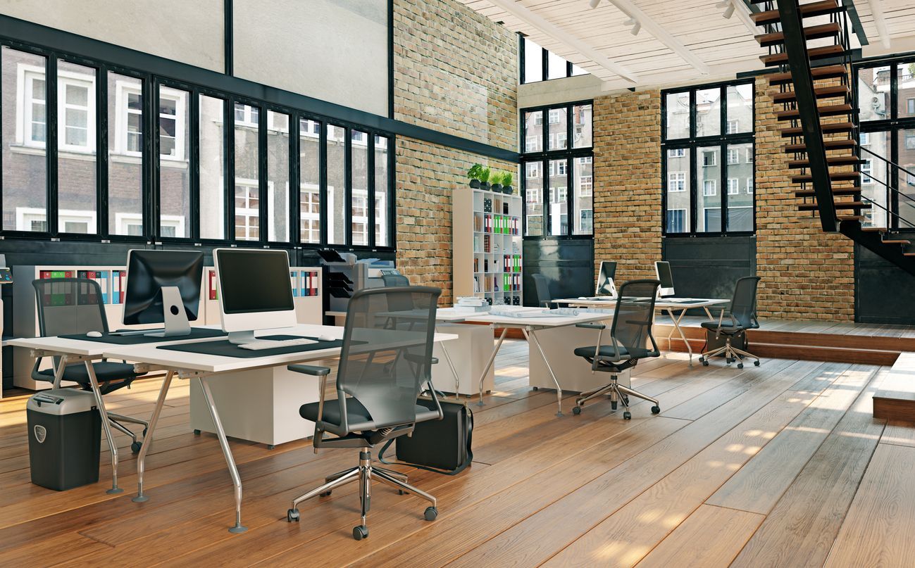
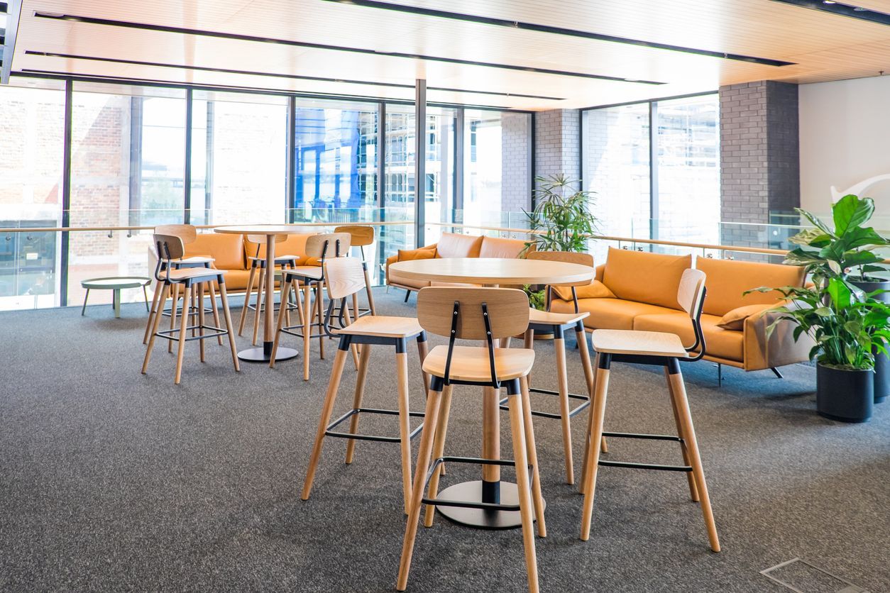
Workplace Highlight: High Contrast Palette for Modern Collaboration
Today’s workplace blends collaboration, focus, and comfort. This palette uses intentional contrast and smooth transitions to support all three. The designers describe their vision:
- High contrast flooring enhances modern office aesthetics and defines collaborative areas.
- Deep green tones offer a grounding visual element that supports clarity during meetings and group work.
- Black and white accents guide the eye toward shared spaces and creative zones.
The palette reflects the evolving needs of work environments that value connection and innovation.
Designing for Impact: Sound, Sustainability, and Well Being
Flooring shapes more than appearance. It also influences acoustics, wayfinding, and overall comfort. Sustainable materials, smart installation choices, and proper acoustic planning help create healthier, more effective environments. Whether in classrooms, residences, or offices, thoughtful flooring design plays a key role in user experience and long term performance.